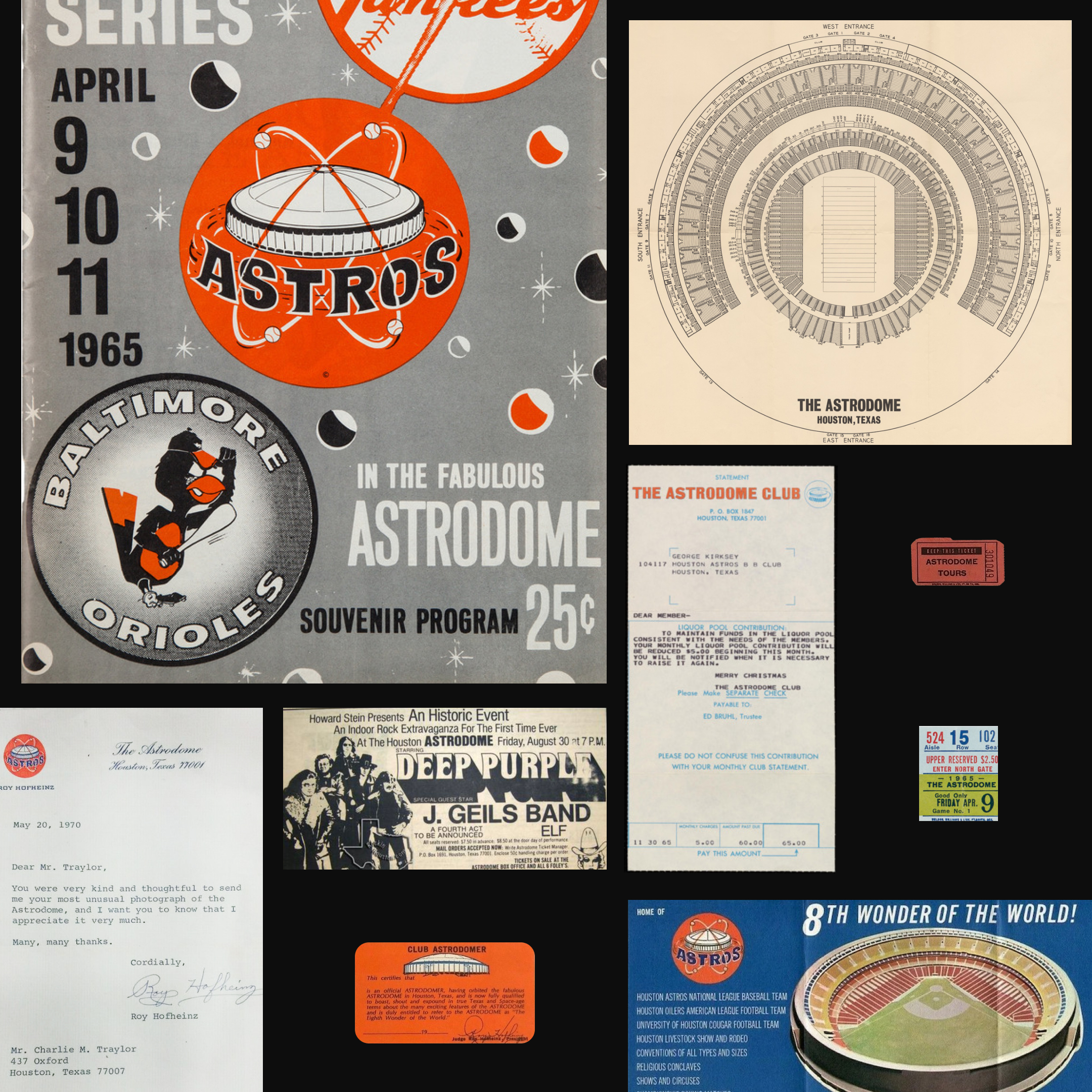
Astrodome
I worked on developing a new identity for the legendary Houston venue, the Astrodome, with the goal of highlighting the venue's iconic dome structure and repositioning it as a premier destination for live music. The branding efforts aimed to revitalize the Astrodome as a sought-after entertainment destination.
Category: Identity, Motion, Website
Mentor: Jorge Montero
Typefaces: Gravity by ABC Dinamo and DM Sans & Mono by Colophon
The Brand
The Astrodome's brand identity features a classic color palette of blue and orange, a nod to the venue's history as the former home of the Houston Astros.


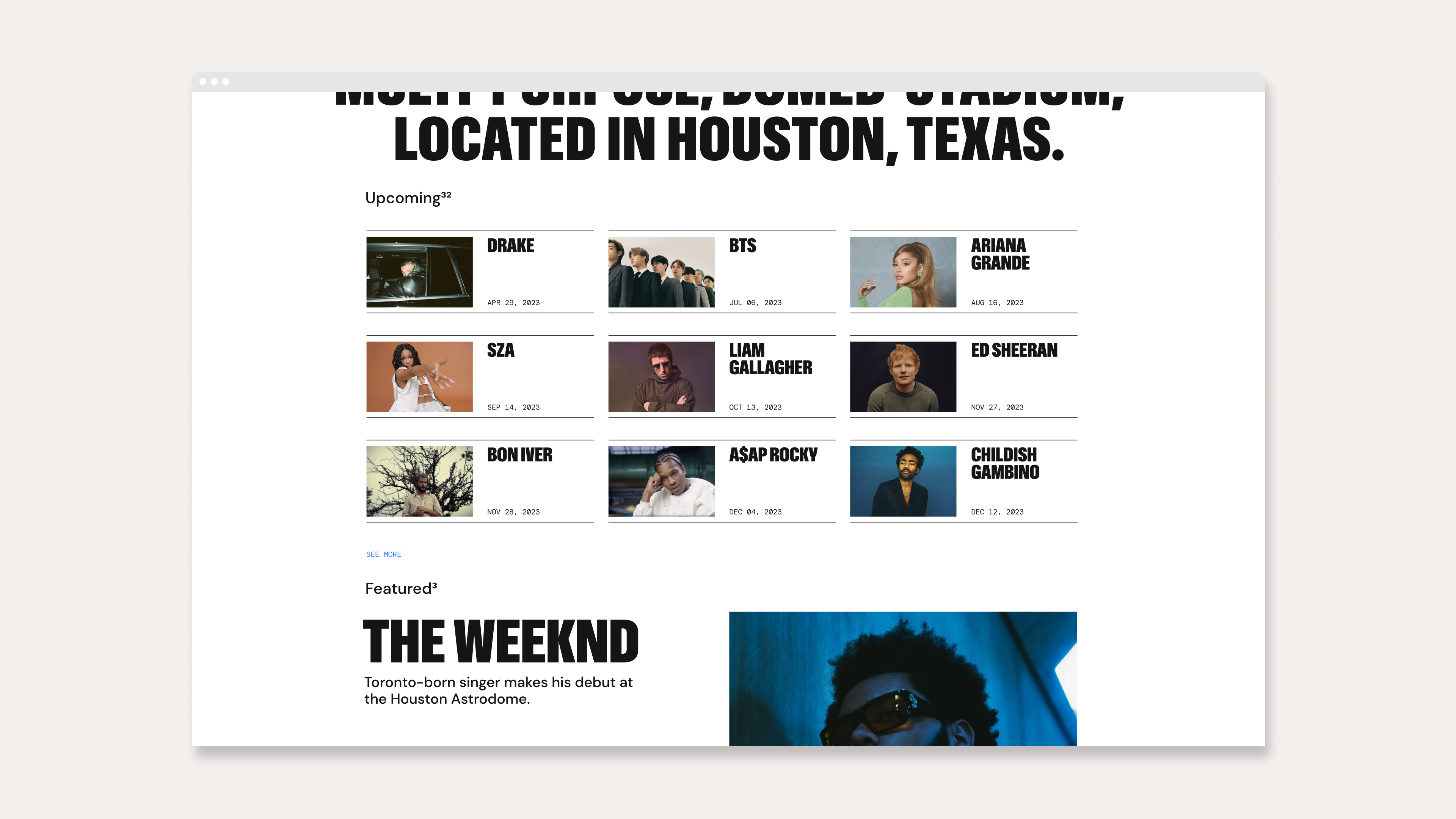
Digital
The identity was designed with an emphasis on motion and web applications, utilizing the blue and orange color scheme for highlighting copy. The icon features a scaling bloom animation, and the website and other digital materials include dynamic swipes for revealing images and text.


Stationery
The brand thrives in print, using a combination of the iconic blue and orange colors with a light grain off-white paper stock.


Physical Application
The Astrodome branding is also meant to function on all sorts of physical applications. From usher’s pins, to wildposting, to merchandise for the general public.


Signage
The identity includes a set of icons to assist with wayfinding. These icons are intended to help visitors navigate the facility more easily and efficiently.

