Type Tools
Type tools (type-tools.com) is an interactive website for customizing typography with tools like blur, dither, line, type and slice. It enables real-time type transformation through shape, texture, and distortion.
Year: 2025
Year: 2025
Category: UI, Website


Material 3 Expressive
Since joining Google's Material team in June 2022, I've had the pleasure of contributing to exciting projects that have shaped the evolution of Google's design language. Material 3 Expressive represents a signifcant update to the design system, read about it here.
Due to confidentiality agreements, please contact me directly for specifics about my work at Google.
Year: 2025
Due to confidentiality agreements, please contact me directly for specifics about my work at Google.
Year: 2025
Category: UI
, Design Systems
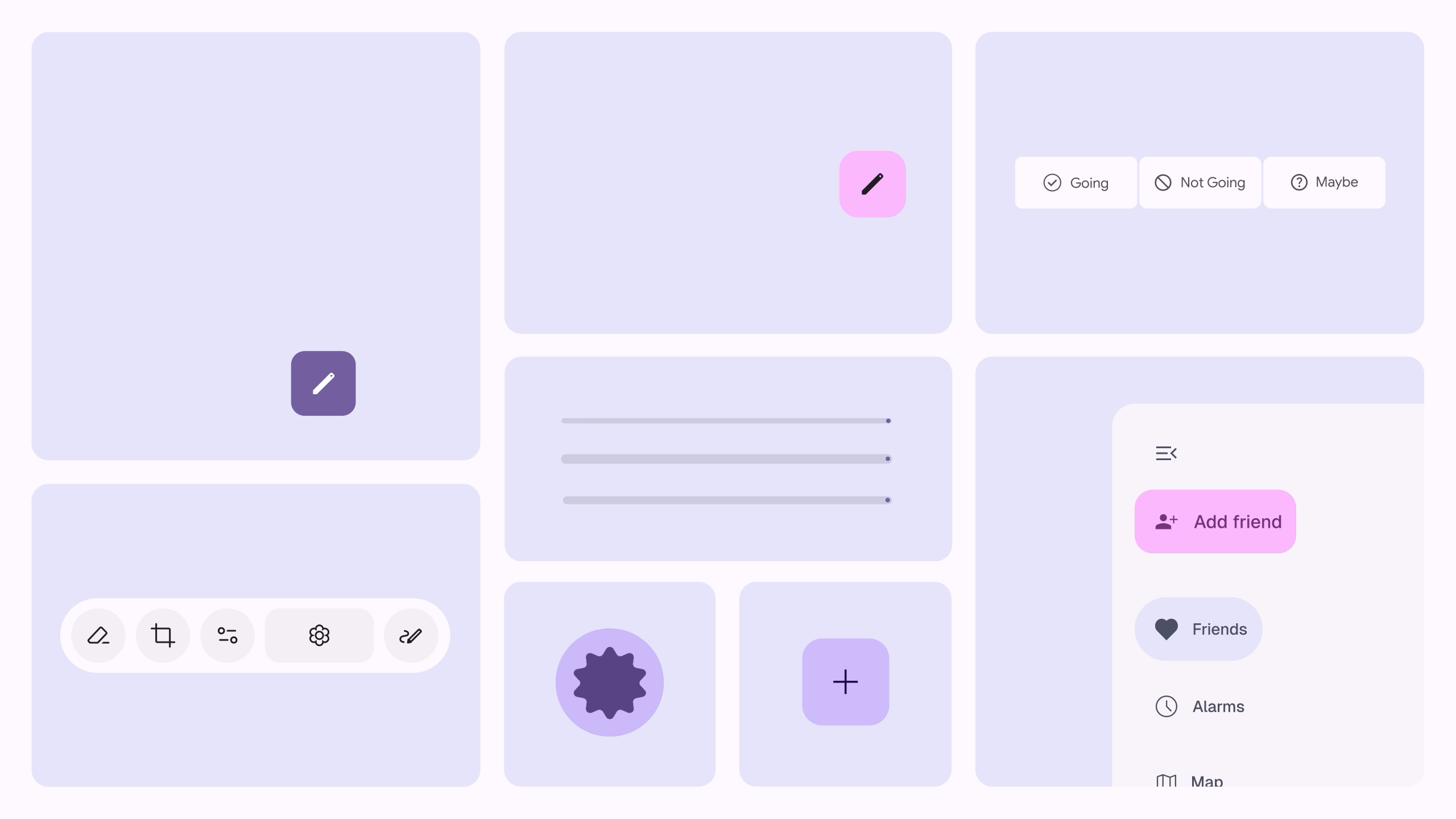
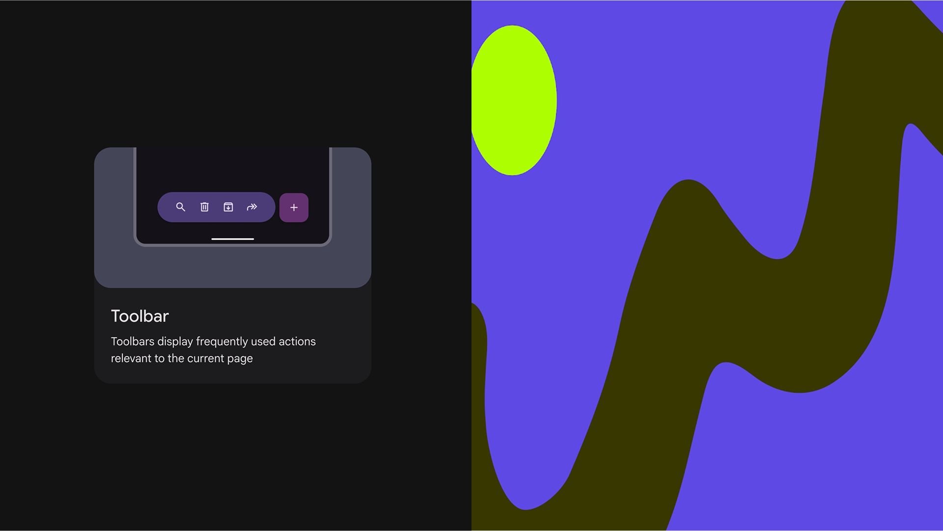
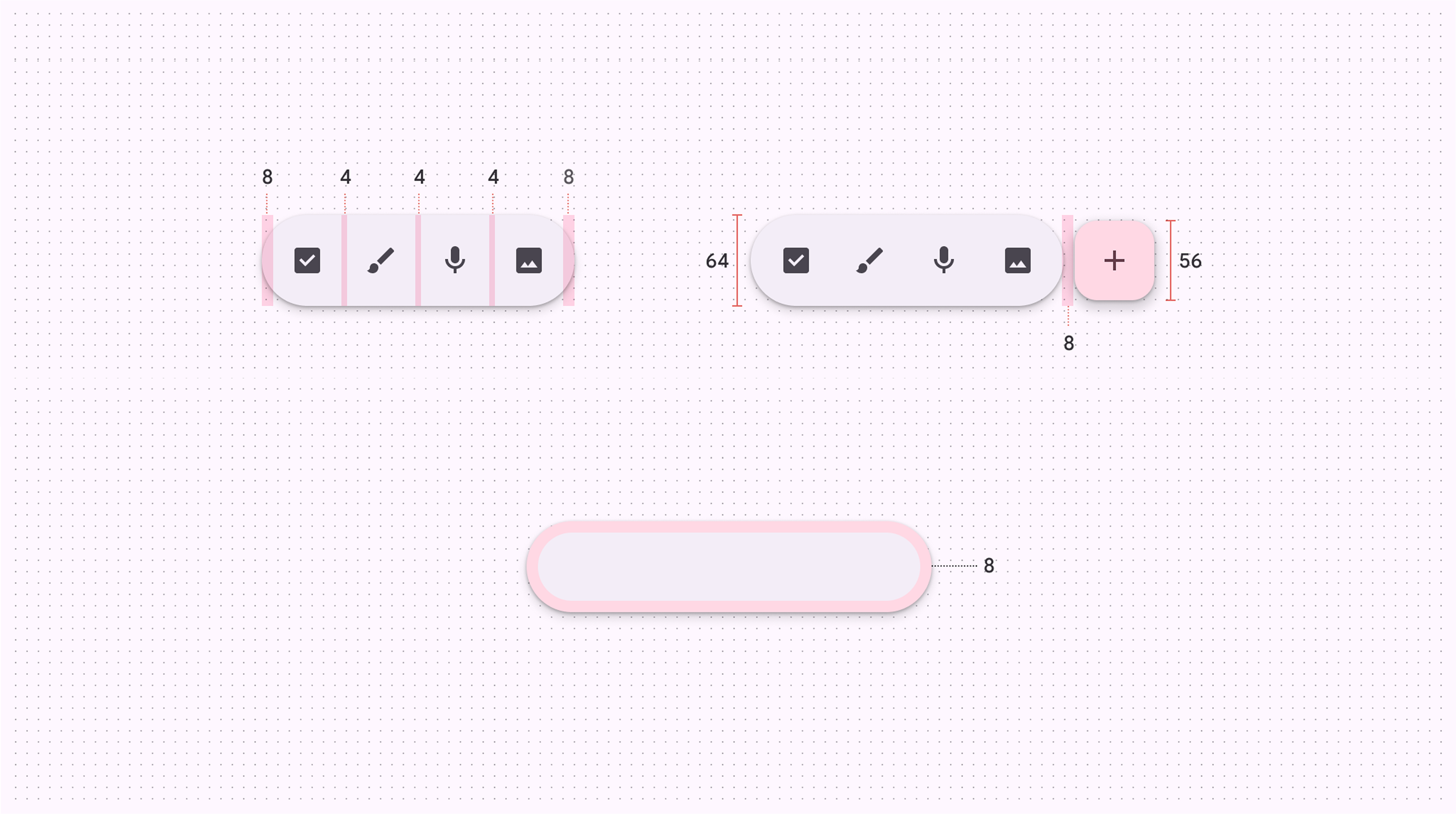
Expressive toolbar
As a visual designer, I contributed sketches, prototyping and consulted the implementation of the new toolbar component.
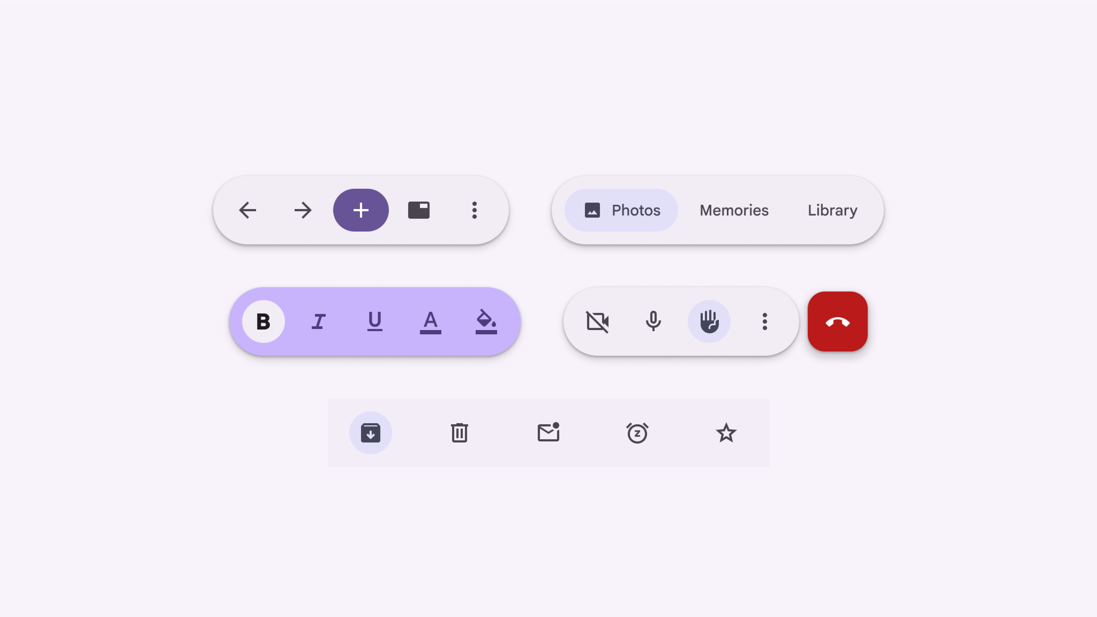

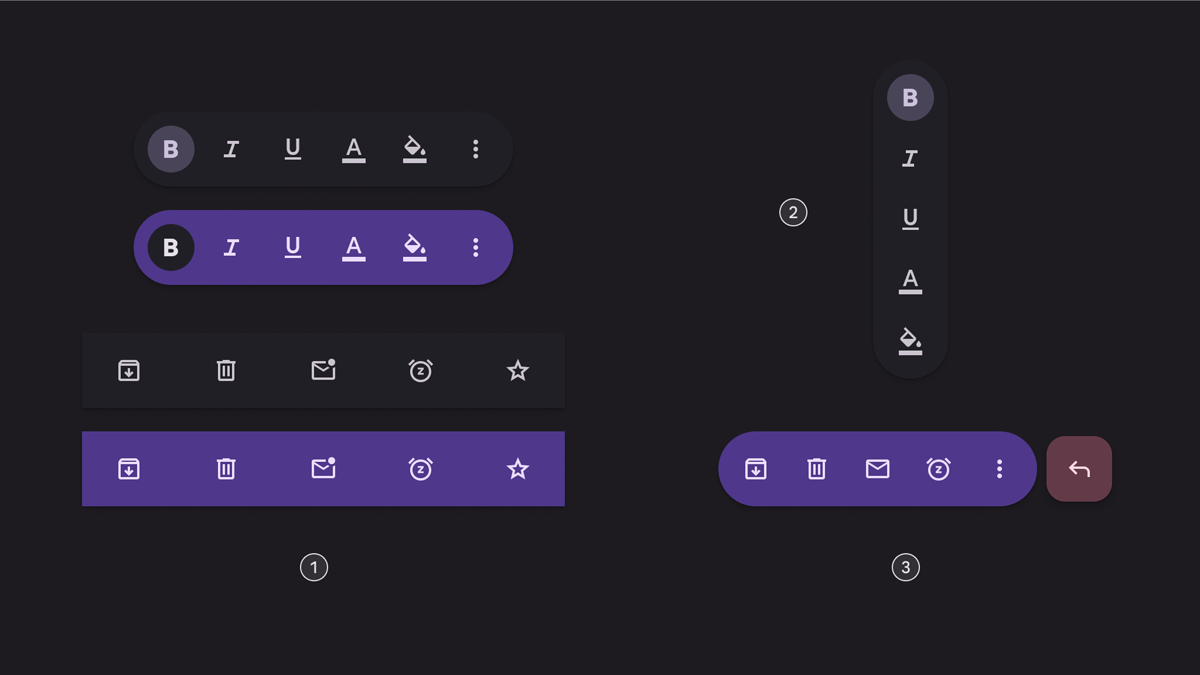
Expressive app bar
I also contributed sketches, prototyping and consulted the implementation to evolve the top app bar component, including giving it a new name.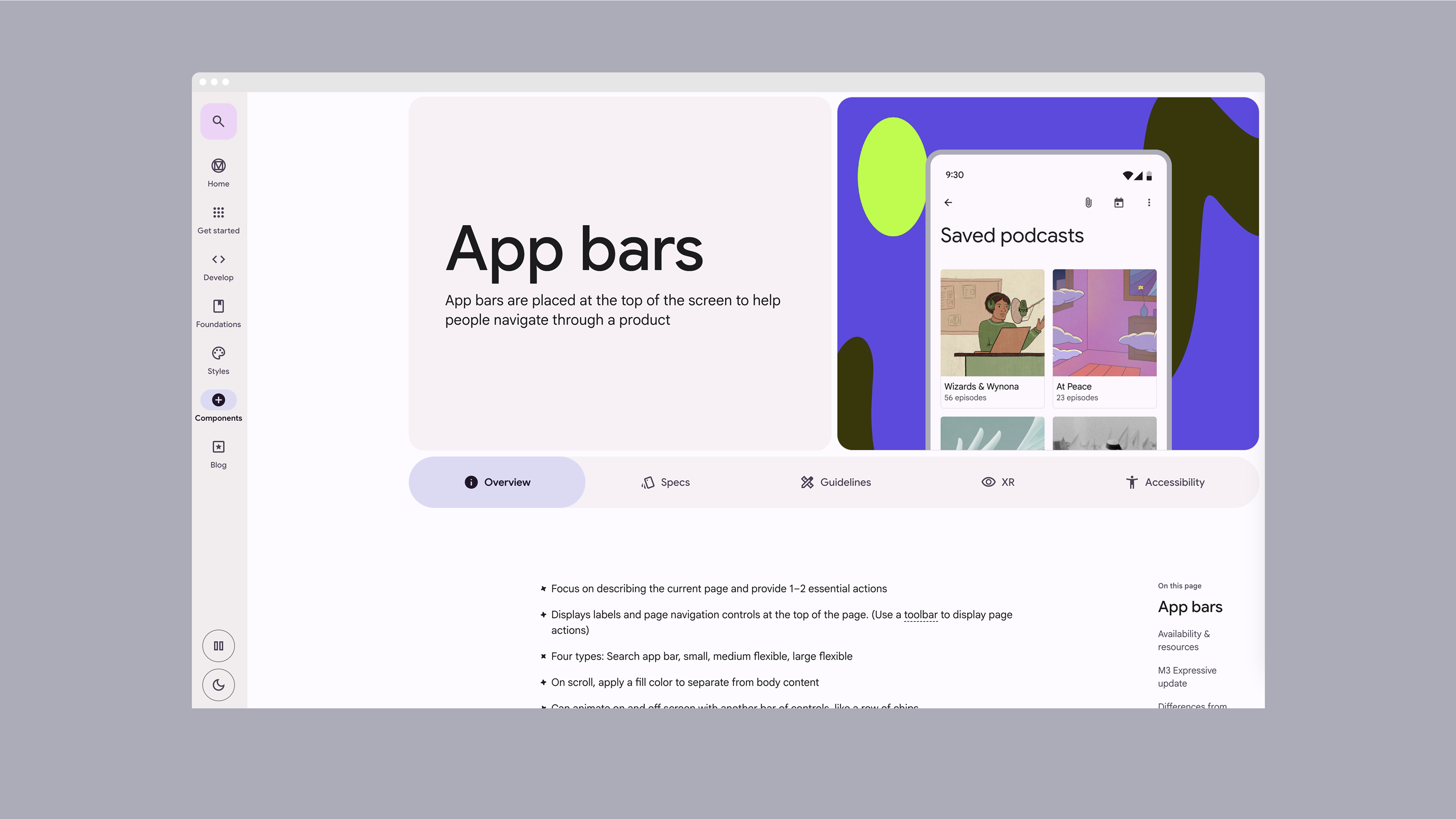


Google Material Design
If you're not familiar with Material Design, Google's design language, these videos provide an introduction to the system's third iteration, Material You.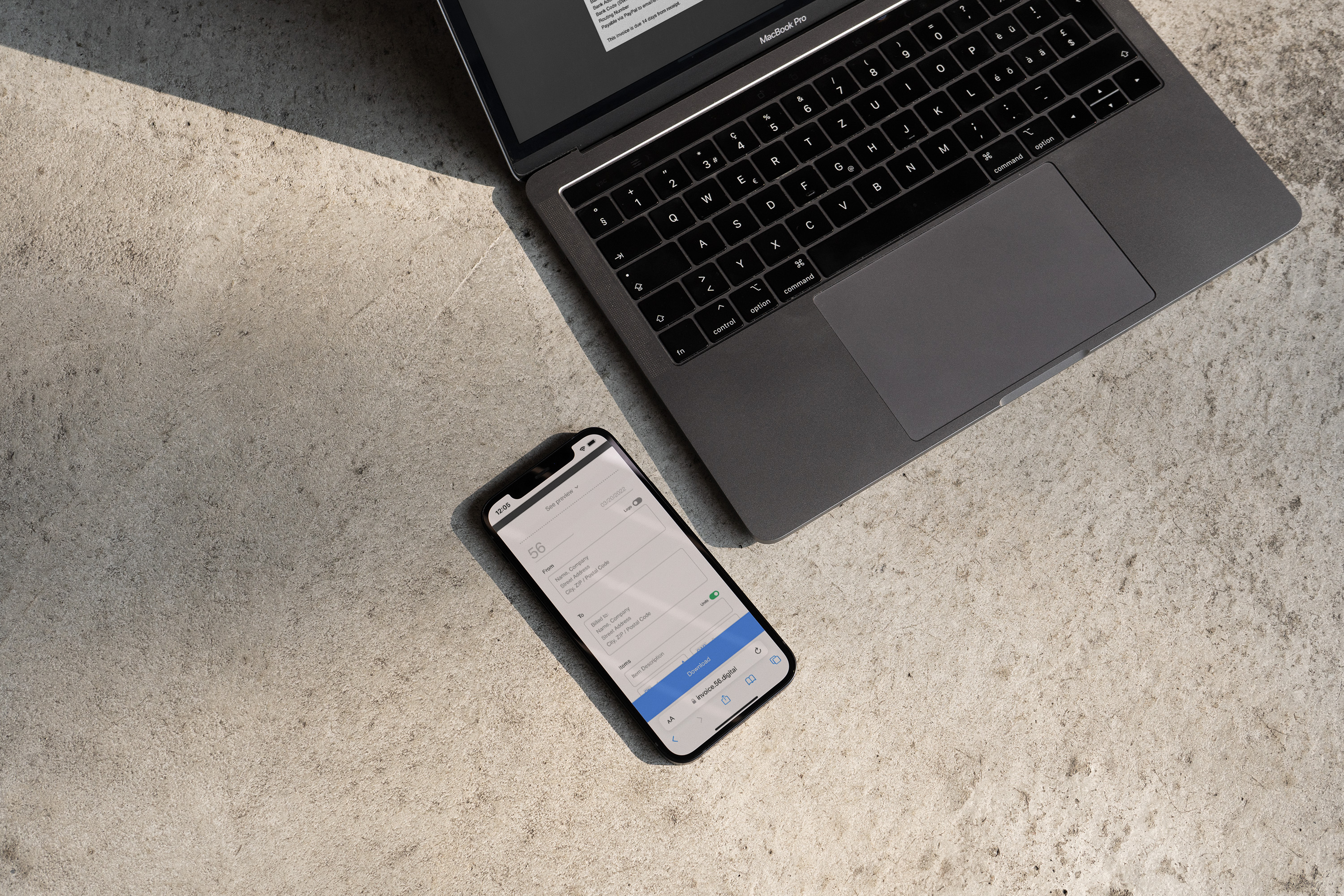
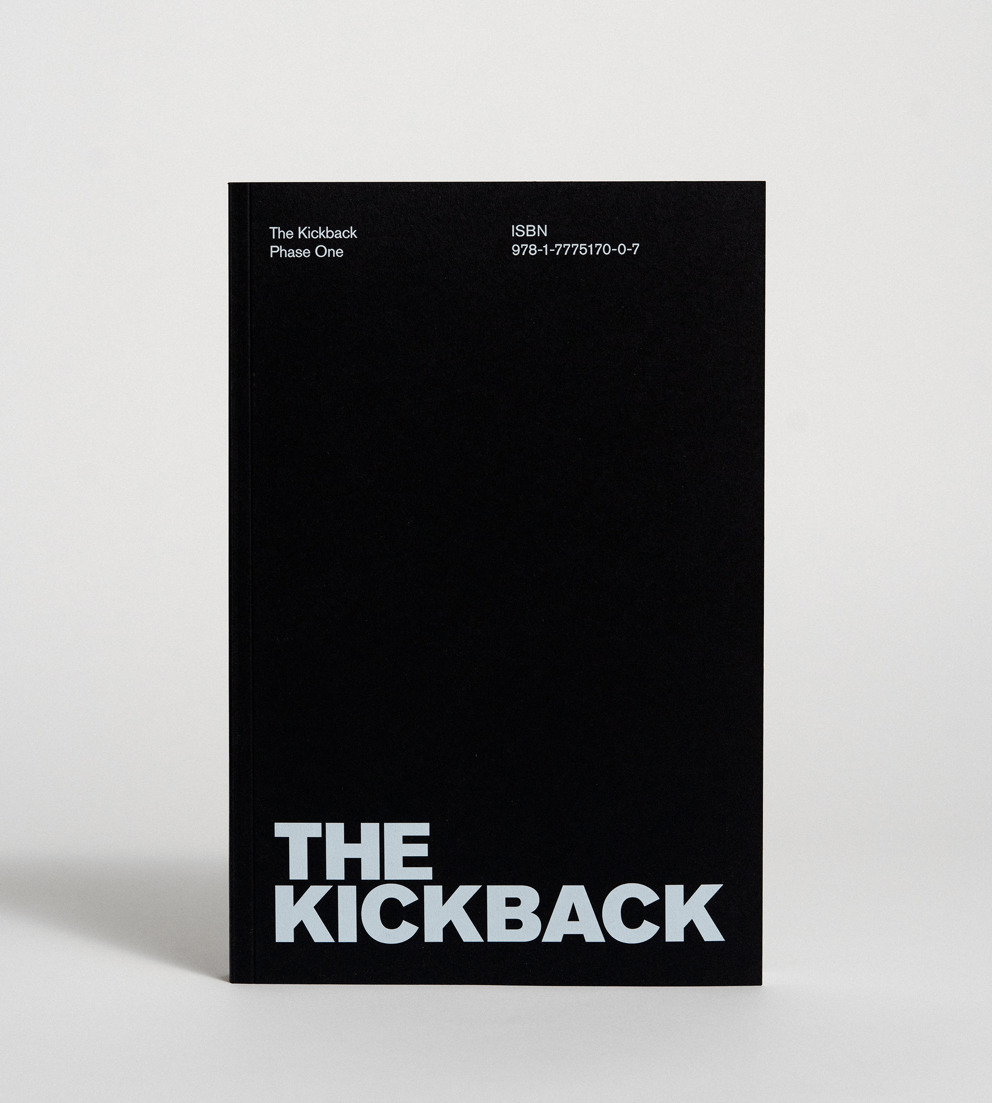
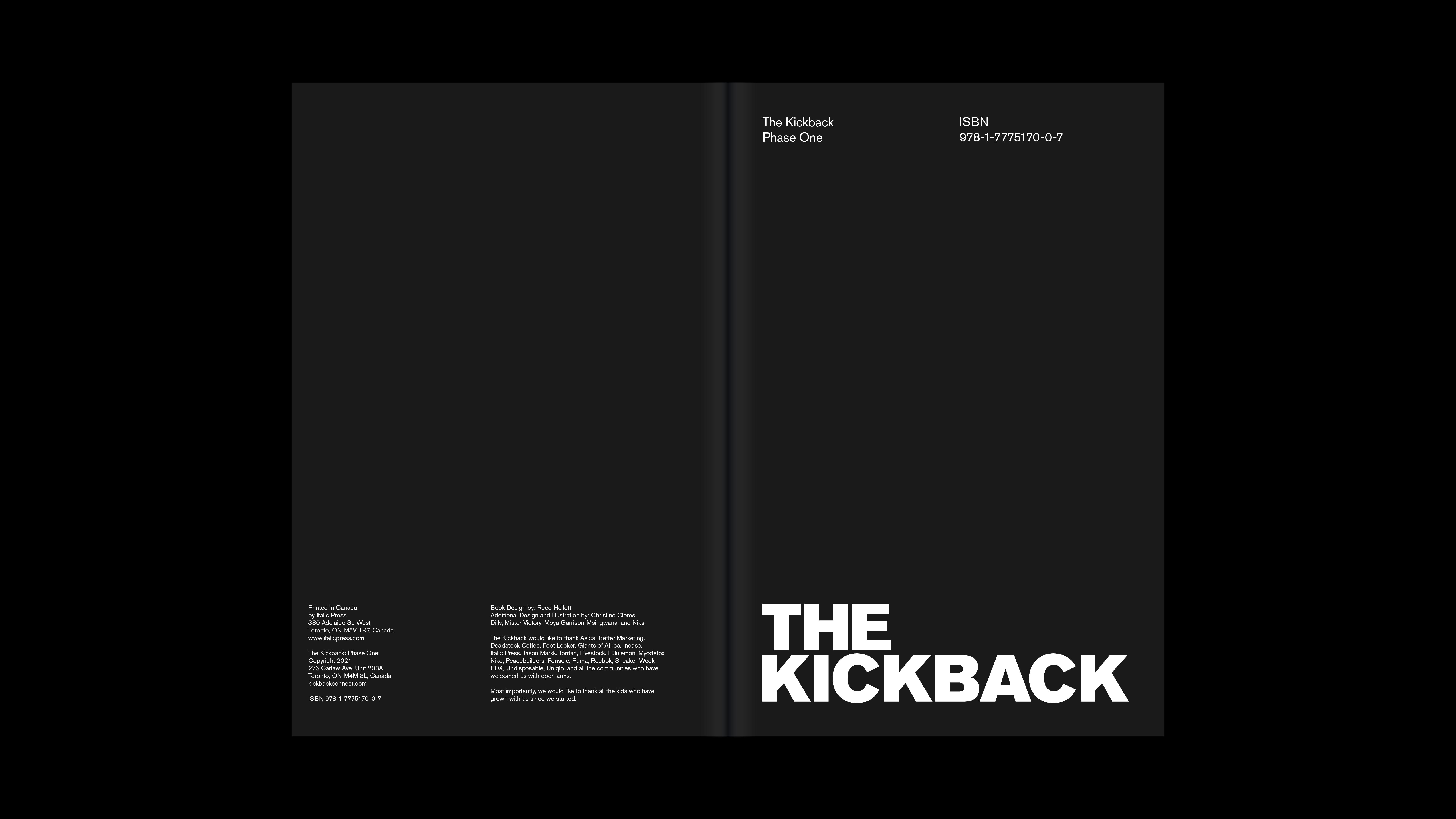
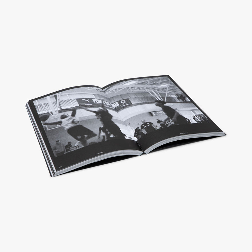
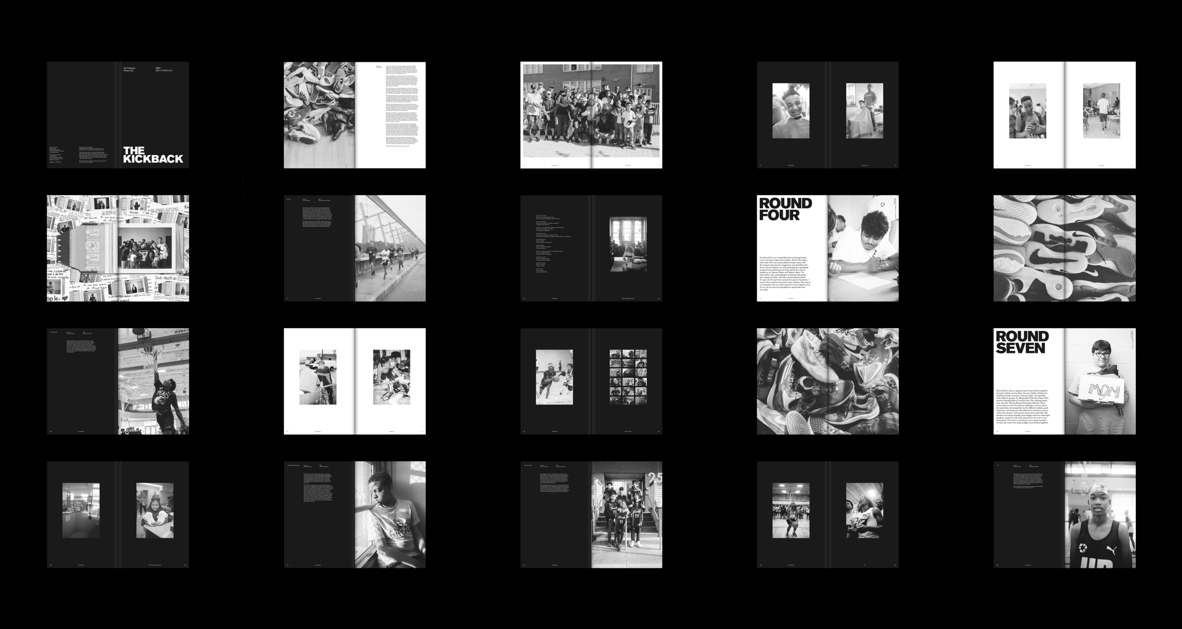
The Kickback
I assisted with the design and production of an archival book and accompanying collateral materials for a new charitable organization. The project involved compiling and designing the book over a period of 10 weeks, as well as updating the organization's brand identity to align with their unique initiatives.
Category: Identity, Publication, Motion, Website
Mentors: Jamal Burger & Jane Zash
Collaborator: Niks
Photography: Tyler Hayward
Publication Page Count: 272


Spreads
The project required me to learn about the content management for long-form books, which involved designing unique asymmetrical layouts for each page. To streamline the process, I created approximately 10 templates to use as a framework for the content.

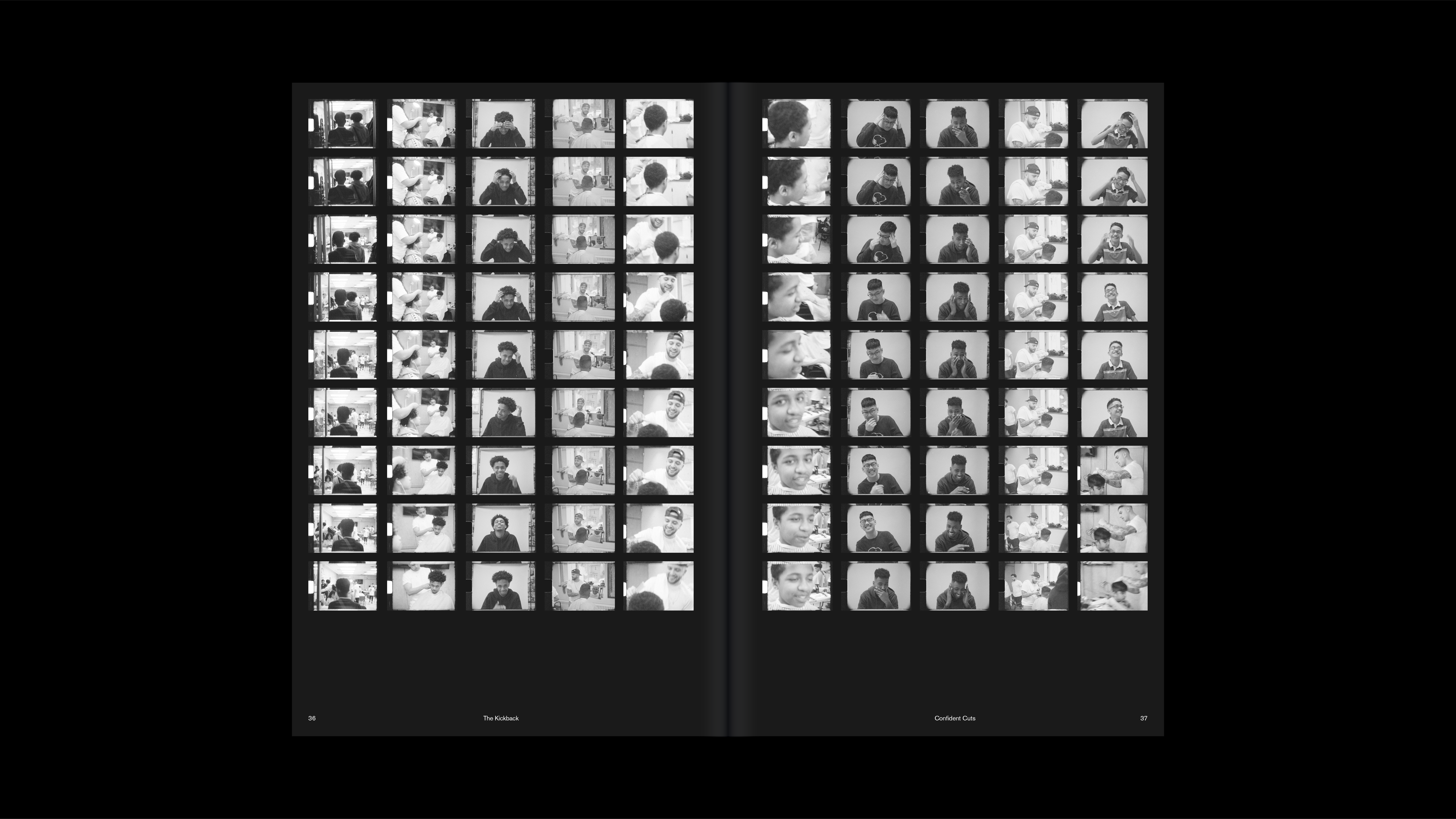
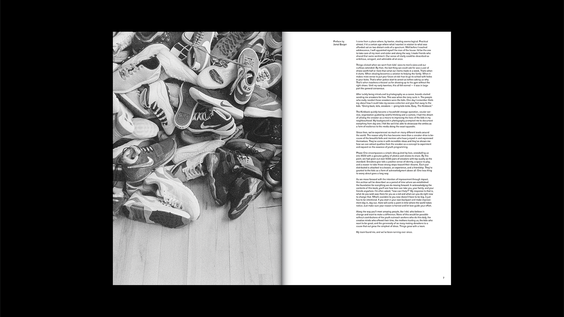
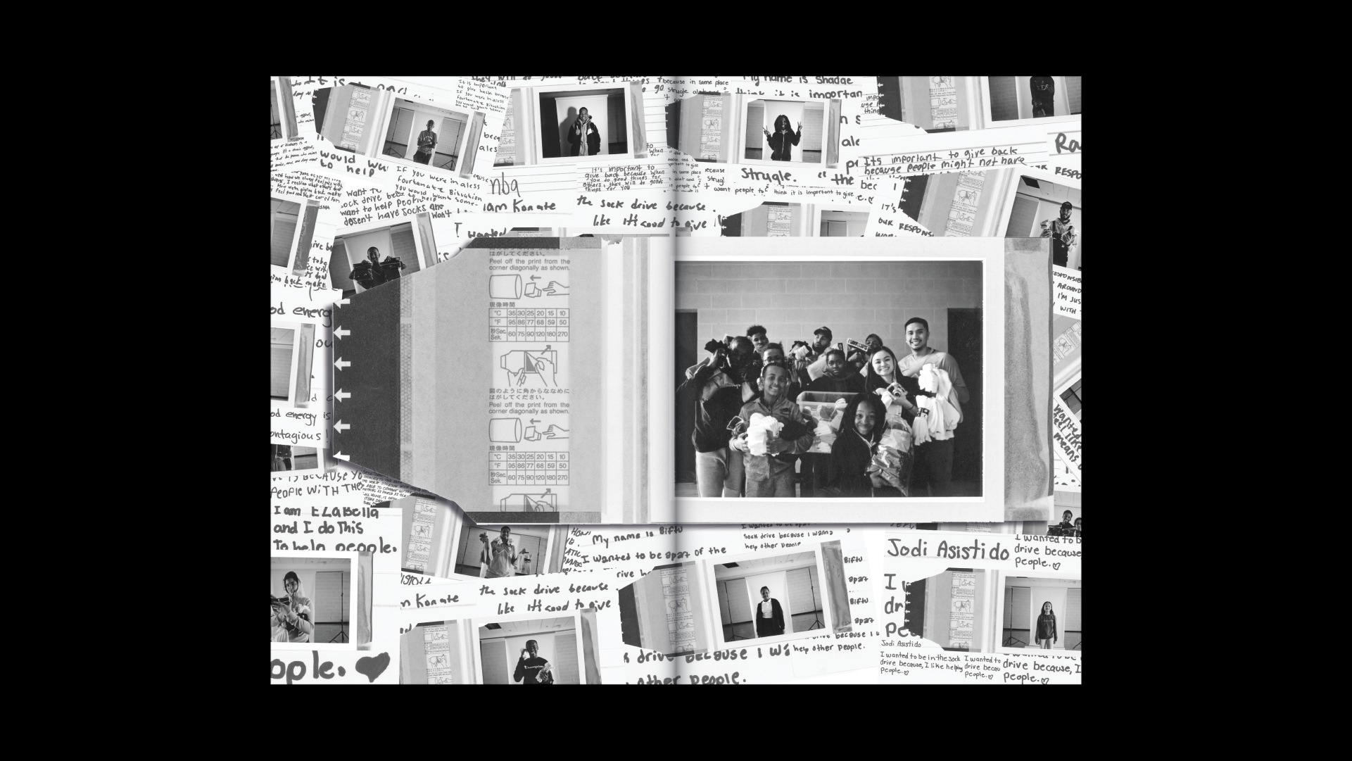


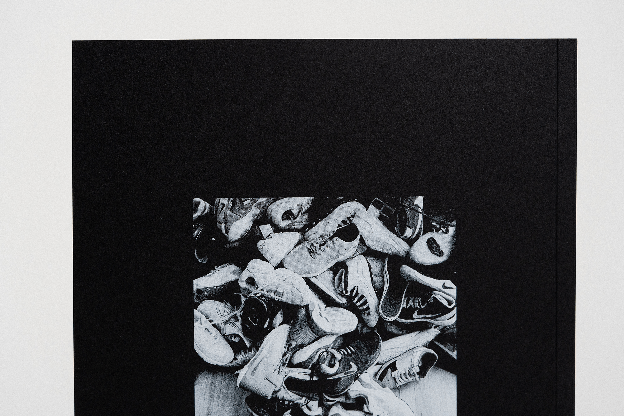
Four Year Archive
Given the focus on photography within The Kickback, the first four years of the organization generated a large collection of photos. The resulting book, featuring 272 pages of black and white photography, was printed and sold in a limited run of 300 copies.
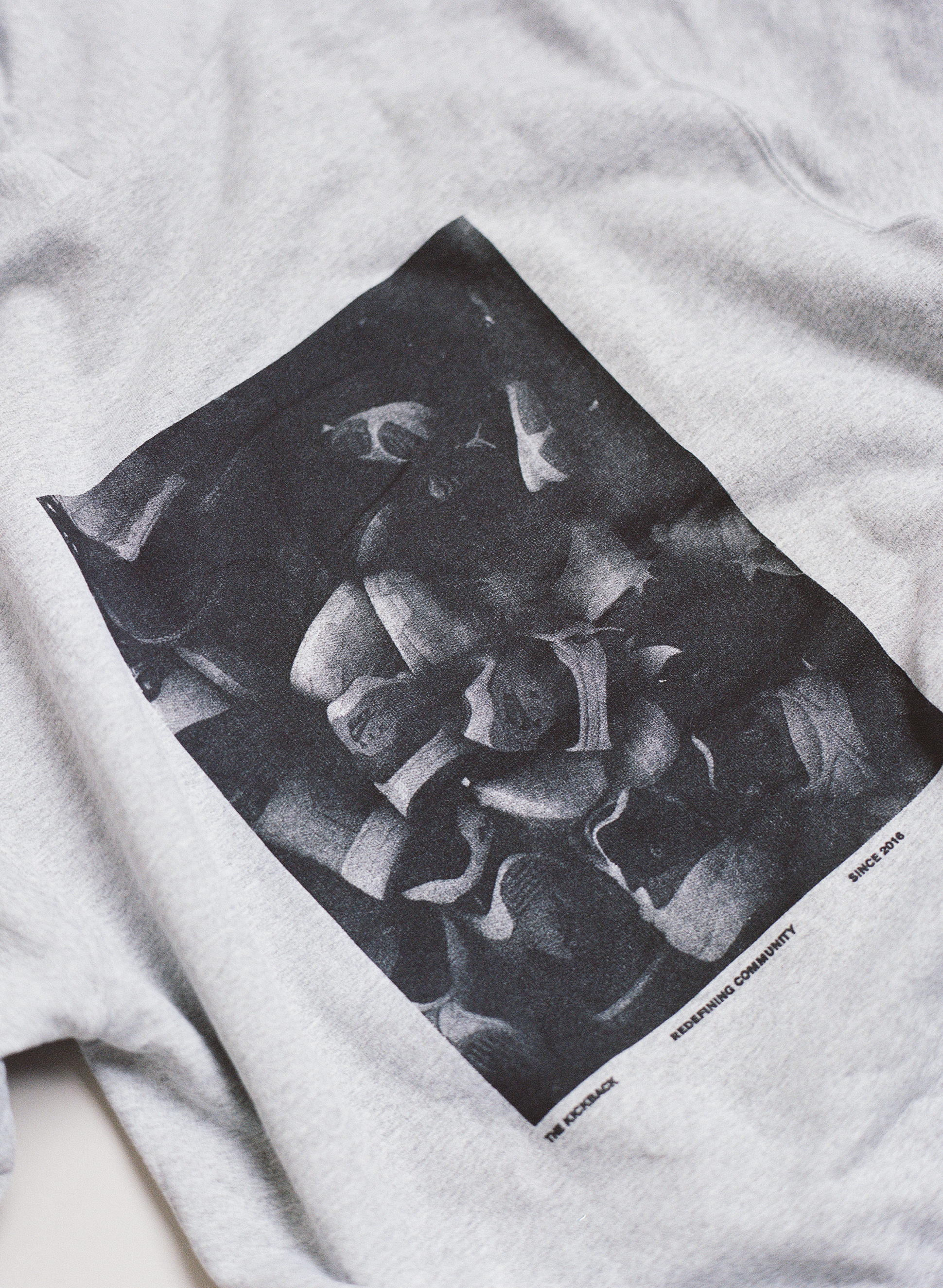
Merch
To launch the updated brand, we produced hoodies in five colors featuring a bitmapped image from one of The Kickback's sneaker drives on the back. The text bar on the back also includes the year of The Kickback's founding (2016) and the organization's slogan, 'Redefining Community'.

Brand Guide
To maintain consistent usage of the brand's logos and typefaces, I assisted in creating a brand guide for future designers. The guide covers applications such as web and stationery, and I also compiled all necessary design assets into an easily accessible online design kit.
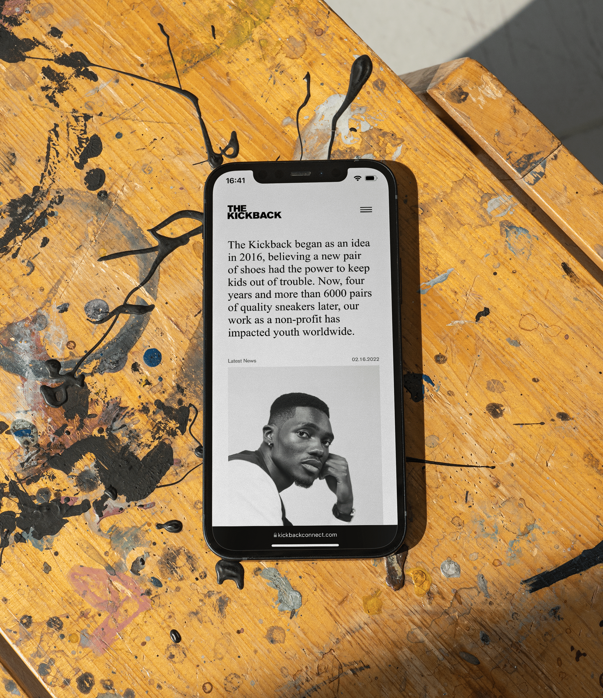
Website
The Kickback's website serves as a platform for receiving donations and inquiries, and also features regularly updated content and stories. My goal in designing the website was to quickly provide visitors with information about the organization and offer easy access to past initiatives and blog posts.
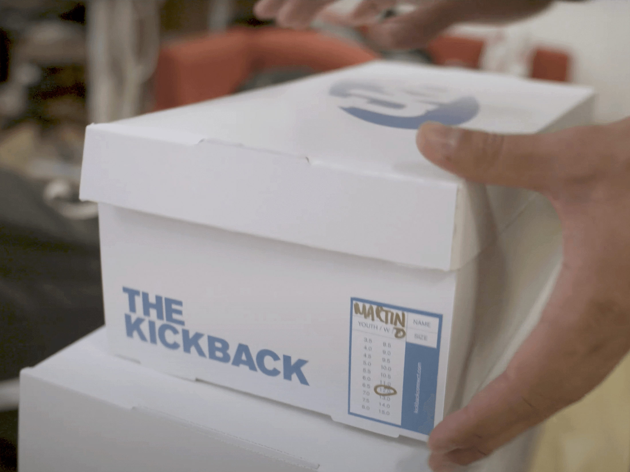
Shoe Boxes
In addition to designing shoeboxes for shoe donations, I created a sticker system to streamline the distribution process. The stickers have designated areas for the recipient's name, the shoe category, and size (ranging from US3.5 to US16) to be marked with a pen.

Check out some of the process work here.
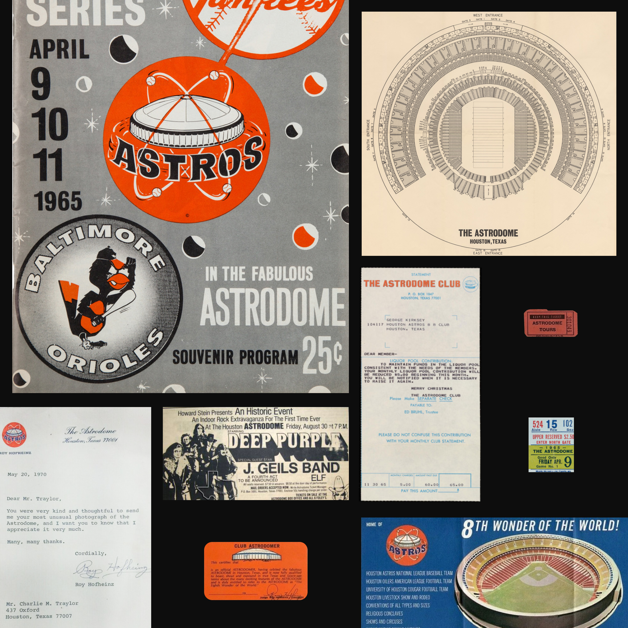
Astrodome
I worked on developing a new identity for the legendary Houston venue, the Astrodome, with the goal of highlighting the venue's iconic dome structure and repositioning it as a premier destination for live music. The branding efforts aimed to revitalize the Astrodome as a sought-after entertainment destination.
Category: Identity, Motion, Website
Mentor: Jorge Montero
Typefaces: Gravity by ABC Dinamo and DM Sans & Mono by Colophon
The Brand
The Astrodome's brand identity features a classic color palette of blue and orange, a nod to the venue's history as the former home of the Houston Astros.


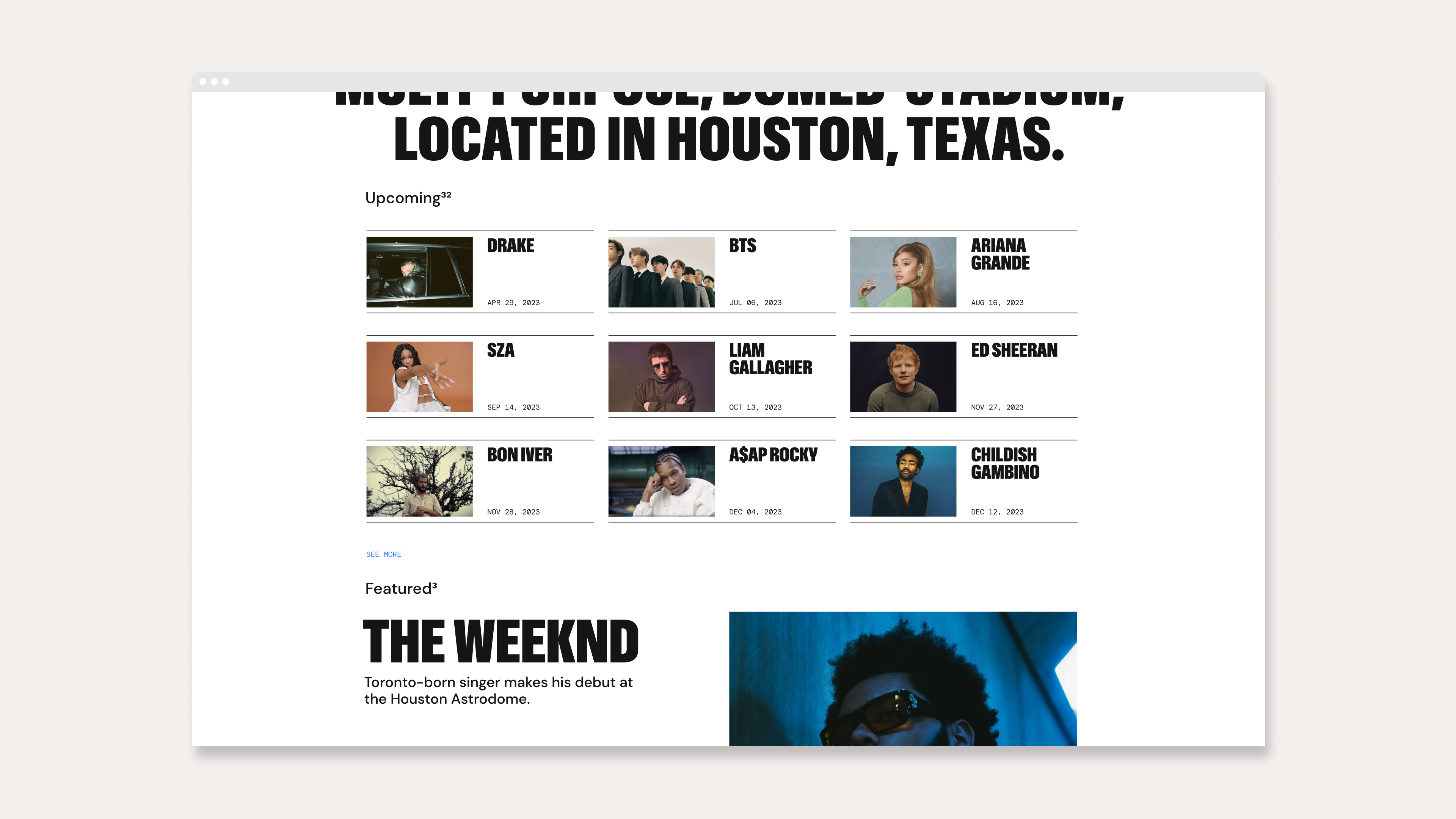
Digital
The identity was designed with an emphasis on motion and web applications, utilizing the blue and orange color scheme for highlighting copy. The icon features a scaling bloom animation, and the website and other digital materials include dynamic swipes for revealing images and text.


Stationery
The brand thrives in print, using a combination of the iconic blue and orange colors with a light grain off-white paper stock.


Physical Application
The Astrodome branding is also meant to function on all sorts of physical applications. From usher’s pins, to wildposting, to merchandise for the general public.


Signage
The identity includes a set of icons to assist with wayfinding. These icons are intended to help visitors navigate the facility more easily and efficiently.

